The dashboard displayed upon launching the application presents key information read by the monitoring devices. It includes all hubs and sensors added to the account, regardless of whether they have been activated, configured, or have sent any data to the cloud.
From the dashboard, you can read current values from the device, view detailed data, change the configuration, and add a new sensor or hub.
Tile and List views are two different ways of presenting data in the CoolSens system, aimed at facilitating the analysis and management of information.
Tile View presents data in the form of visual tiles that include large icons and values, as well as a temperature chart for the last 24 hours. This presentation method is intuitive and makes it easy to quickly recognize key information, particularly useful for real-time monitoring of parameters.


List View, on the other hand, presents data in the form of a table, organized into rows and columns. Each row corresponds to a different device, and the columns represent various values read by these devices. This presentation method allows for more detailed analysis and comparison of data, making it ideal for working with large amounts of information.


Both ways of presenting data offer unique benefits, and the choice between them depends on the specific needs of the User and the type of data being analyzed.
To switch between views, use the button displayed in the upper right corner of the screen.


Each device added to the account is displayed in the system as a card (tile) containing the current parameters:

The measurement status allows you to quickly assess whether all parameters are within the normal range or if they require attention.

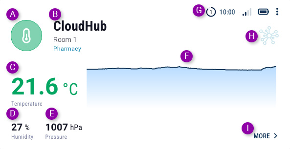
All measured parameters are within the normal range (their values fall within the recommended ranges).

The temperature has exceeded the recommended value (it is outside the optimal range, but has not exceeded the alarm threshold).

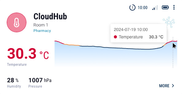
The temperature has exceeded the alarm threshold.

Air humidity has exceeded the recommended value (it is outside the optimal range, but has not exceeded the alarm threshold).

Air humidity has exceeded the alarm threshold.

The device configuration has been changed by the user, but the changes have not yet been saved to the hub. The modified configuration needs to be sent to the hub (use the Configuration -> Send Configuration button).

The system waits for contact with the hub to save changes made to the device configuration. Since these are battery-powered devices, they sleep between periods when they send devices to the cloud.

The device is being programmed - changed parameters are being sent and saved in the concentrator.

This status will be displayed in the following cases:

Sensor deactivated by the User - remains connected to the hub, but data is not transmitted from it.
You can activate the sensor by changing its settings (find out how) or by configuring the hub it is paired with (find out more).

The sensor is not paired with any hub.
You can connect the sensor to the hub by changing its settings (find out how) or by configuring the hub you want to pair it with (find out more).
The most crucial parameter monitored by the CoolSens system is air temperature. Therefore, the temperature value is displayed in the largest font and additionally presented in a chart showing temperature changes over the past 24 hours.
When you hover the mouse cursor over the chart area, the value, date, and time of the air temperature measurement at that specific point on the chart will be displayed.

After clicking the configuration button, a window will appear next to the sorting and filtering buttons allowing you to enable axis labeling on the graphs and display alarm thresholds.

The status bar in the upper right corner of each device card contains a series of icons with important information about the device itself.


When you have a large number of hubs and sensors in one location (on one account), the sorting and filtering feature can be useful.


The tile view, although aesthetically appealing and intuitive, has its limitations compared to the tabular view. The tabular view allows you to display a large number of devices on one screen in an organized manner. Each device is represented by a single row in the table, allowing you to quickly view information without having to scroll.

The table columns are clearly labeled, making it easy to compare different parameters such as temperature, humidity, battery status, and last communication time.
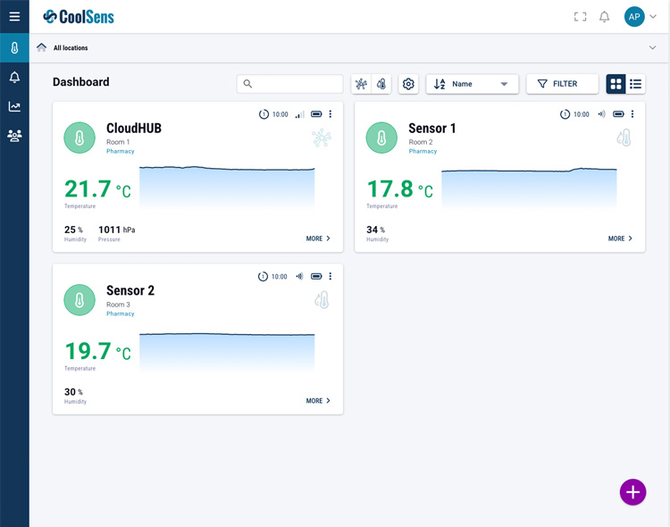
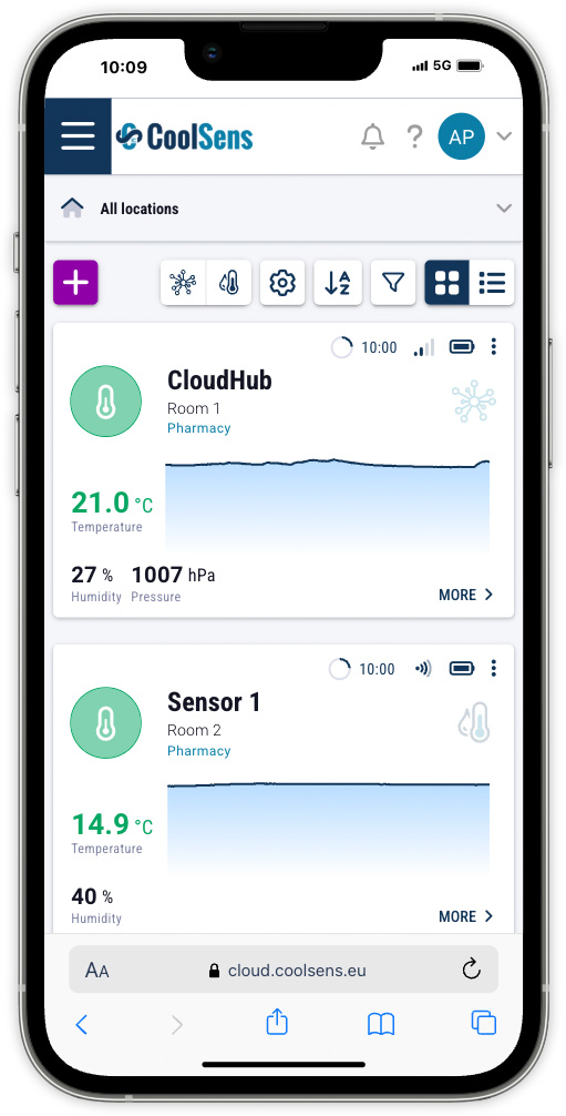
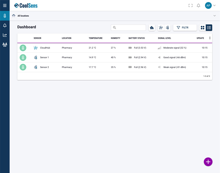
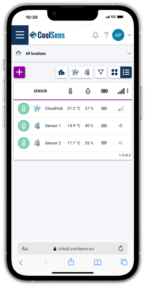
The table contains the following columns:
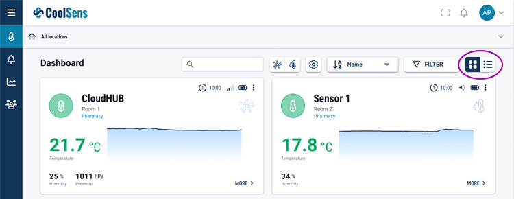
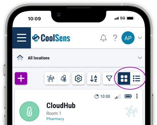
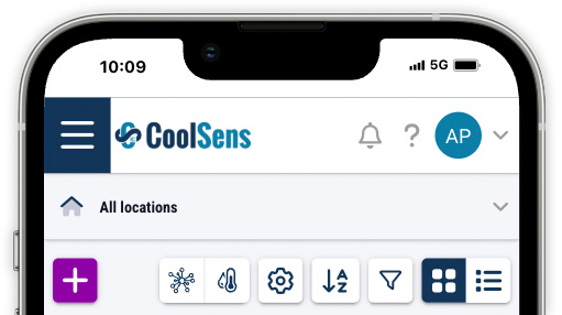
The List View allows you to sort devices by any column. For example, you can quickly sort devices by temperature (click the temperature label in the column header) to see which ones are the warmest or coolest.
Click on the desired label in the table header to select the column by which the table should be sorted. An arrow appears next to the label indicating the sorting order. To change the sorting order (ascending/descending), click the selected label in the column header again.
Similar to the tile view, the table view allows you to filter devices to those that meet specific criteria (device type and status, measurement status).
The device type filter button allows you to quickly search for all hubs or display only sensors. Click the appropriate button to enable filtering, click it again to disable filtering.
The Device Grouping button allows convenient management of the device list by grouping them in a table based on their location. This feature makes it easier to find devices assigned to specific locations, especially in large datasets.
With this feature, the device table changes to an “accordion” structure, enabling quick navigation between different groups without the need to scroll through the entire table.
Clicking the Device Grouping button:Each location header is interactive. Clicking on a location header: